
Design
Overview
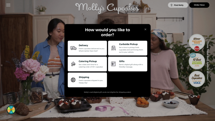
Molly’s Cupcakes is a boutique bakery brand known for its handcrafted cupcakes.
The previous online ordering system lacked clarity, product visualization, and interactivity — making it difficult for customers to build custom cupcake trays and complete their orders.
I redesigned the entire experience with a focus on micro-interactions, visual guidance, and intuitive product selection, transforming it into a delightful eCommerce journey.
The Challenge
The earlier website forced users to make multiple confusing choices without feedback or visual cues.
Customers struggled to understand how to customize their cupcake tray or preview their selection before checkout.
The challenge was to design an interface that made custom ordering effortless, while keeping the experience playful and true to the brand’s friendly personality.
My Design Approach
I began by analyzing user behavior and mapping the pain points in the old flow.
The new design introduced a step-by-step builder where users could easily select cupcake types, fill their tray visually, and review their order with dynamic animations.
Every stage included micro-interactions that provided instant feedback — hover states, tray animations, and progress indicators — all aimed at creating a sense of joy and confidence.
The visual language was built around warmth and simplicity: bright colors, rounded components, and soft shadows that reflect the bakery’s cheerful vibe.
Design System & Key Highlights
- Visual Product Selector: Users can view cupcakes in real time while building their tray.
- Interactive Tray Builder: Dynamic drag-and-drop tray system with smooth transitions.
- Micro-Interactions: Animated states that respond instantly to user actions for better feedback.
- Simplified Checkout: Clean, single-page checkout flow optimized for mobile.
- My Role: Complete redesign including UX analysis, UI design, and motion direction.
Results
Usability testing showed that users completed the order process 45% faster compared to the old site.
Customer satisfaction improved significantly, with testers describing the new flow as “fun,” “clear,” and “enjoyable.”
The redesign not only simplified ordering but also made the brand feel more premium and user-friendly.
Reflection
This project reinforced my belief that micro-interactions are the heartbeat of eCommerce UX. When designed thoughtfully, they transform functional tasks into emotional experiences — turning a simple purchase into a moment of delight.